


Overview
Phones are always within reach, and scrolling has quietly become the default way to fill moments of boredom or downtime—often replacing hobbies and offline routines that once brought joy.
A 2024 study in Computers in Human Behavior Reports (800 adults) links frequent doomscrolling to higher levels of existential anxiety, with other studies connecting it to lower life satisfaction and reduced engagement at work.
Tomo explores a new approach—gently redirecting these high-risk scrolling moments toward meaningful real-world activities and personal goals, helping users make more mindful choices without restrictive controls.
Research
By drawing insights through constant user research process via surveys and interviews I established top user needs to address
Process
I blended user challenges with competitive gaps to shape my concept
Current products in the market that aim to solve similar problems provided avenues to explore
Help users regain joy of being offline
Improve sense of self through accomplishments
Support focus during peak productivity moments
Help improve cognitive ability and attention span
Introduce supportive not restrictive forms of accountability
Physical products
Drawbacks
Expensive, restrictive tools can create initial resistance. Lasting behavior change is likely through gradual, repeatable actions
Constraints
Although a self-initiated project, I worked within a four-week ideation timeline and limited resources, which led me to explore a digital solution over physical tools
Digital products

Brick - A $47 physical app blocker that requires tapping your phone on a cube to lock or unlock apps.

Unplug tag - A $80 physical app blocker with similar functionality, requiring a subscription.


Design
Friction points were identified early. Onboarding is quick with just 7 steps to personalize the user's experience. I ensured key features are accessible within 2–3 steps
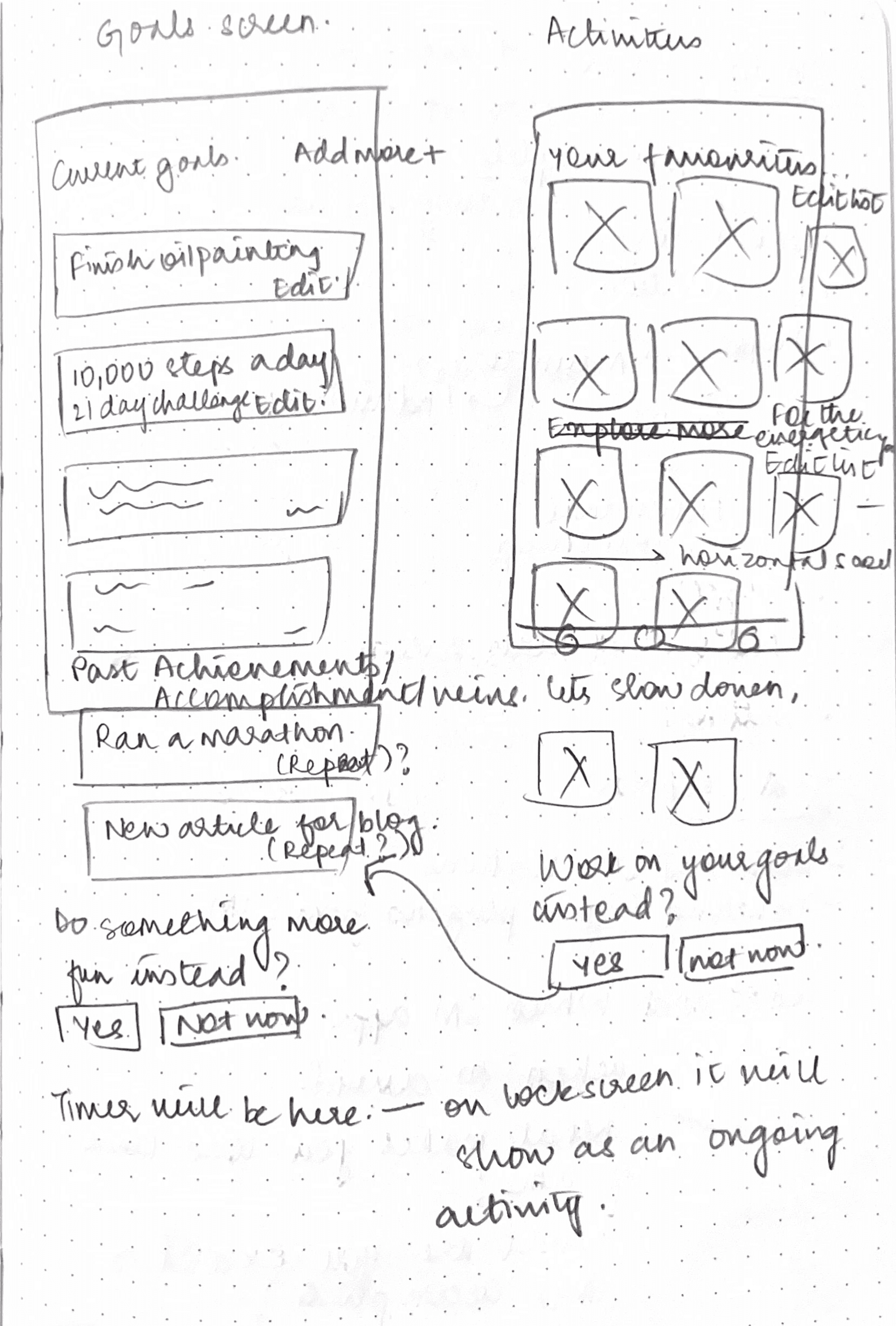
The home screen heirarchy was designed with intention to keep users motivated and help them quickly access their goals and activities
Create and access goals with ease!
Track all your progress in one spot

Encouraging streaks
Daily check in to track rest
Reduced search fatigue
Core feature accessibility
Get notified as you approach your screen limits and choose a more mindful break


I made multiple iterations in initial stages to build a smooth user journey


Nav bar had to be simple for user navigate to core features. I did multiple tests to land the version preferred by most users
I brainstormed features aligned with the product direction, landed my trade offs to prevent scope creep, and prioritized high-impact, low-effort ideas for an MVP built to scale.

One Sec
Custom blocking but lengthy setup

Focus Traveller
Easy setup but limited flexibility

Attentive
Educational but content heavy

Lotus
Goal support but cluttered interface
Narrow focus to offer concrete value
Reduce friction with simple steps
Encourage decision autonomy
Avoid guilt and overwhelm
Visual appeal for enagagement

Tomo - Turning passive screen time into intentional action
Designed a system that helps users redirect attention toward goals, hobbies, and offline activities.
YEAR
Aug-Nov 2025
Tomo - Turning passive screen time into intentional action
Tomo - Turning passive screen time into intentional action
Designed a system that helps users redirect attention toward goals, hobbies, and offline activities.
Designed a system that helps users redirect attention toward goals, hobbies, and offline activities.
Overview
Overview
Phones are always within reach, and scrolling has quietly become the default way to fill moments of boredom or downtime—often replacing hobbies and offline routines that once brought joy.
A 2024 study in Computers in Human Behavior Reports (800 adults) links frequent doomscrolling to higher levels of existential anxiety, with other studies connecting it to lower life satisfaction and reduced engagement at work.
Tomo explores a new approach—gently redirecting these high-risk scrolling moments toward meaningful real-world activities and personal goals, helping users make more mindful choices without restrictive controls.
Research
Research
By drawing insights through constant user research process via surveys and interviews I established top user needs to address
By drawing insights through constant user research process via surveys and interviews I established top user needs to address
Help users regain joy of being offline
Help users regain joy of being offline
Improve sense of self through accomplishments
Improve sense of self through accomplishments
Support focus during peak productivity moments
Support focus during peak productivity moments
Help improve cognitive ability and attention span
Introduce supportive not restrictive forms of accountability
Help improve cognitive ability and attention span
Introduce supportive not restrictive forms of accountability
Current products in the market that aim to solve similar problems provided avenues to explore
Current products in the market that aim to solve similar problems provided avenues to explore
Physical products
Physical products
Brick - A $47 physical app blocker that requires tapping your phone on a cube to lock or unlock apps.
Brick - A $47 physical app blocker that requires tapping your phone on a cube to lock or unlock apps.
Unplug tag - A $80 physical app blocker with similar functionality, requiring a subscription.
Unplug tag - A $80 physical app blocker with similar functionality, requiring a subscription.
Drawbacks
Expensive, restrictive tools can create initial resistance. Lasting behavior change is likely through gradual, repeatable actions
Drawbacks
Expensive, restrictive tools can create initial resistance. Lasting behavior change is likely through gradual, repeatable actions
Constraints
Although a self-initiated project, I worked within a four-week ideation timeline and limited resources, which led me to explore a digital solution over physical tools
Constraints
Although a self-initiated project, I worked within a four-week ideation timeline and limited resources, which led me to explore a digital solution over physical tools
Digital products
Digital products
One Sec
One Sec
Custom blocking but lengthy setup
Custom blocking but lengthy setup
Focus Traveller
Focus Traveller
Easy setup but limited flexibility
Easy setup but limited flexibility
Attentive
Attentive
Educational but content heavy
Educational but content heavy
Lotus
Lotus
Goal support but cluttered interface
Goal support but cluttered interface
Process
Process
I blended user challenges with competitive gaps to shape my concept
I blended user challenges with competitive gaps to shape my concept
Narrow focus to offer concrete value
Narrow focus to offer concrete value
Reduce friction with simple steps
Reduce friction with simple steps
Encourage decision autonomy
Encourage decision autonomy
Avoid guilt and overwhelm
Avoid guilt and overwhelm
Visual appeal for enagagement
Visual appeal for enagagement
I brainstormed features aligned with the product direction, landed my trade offs to prevent scope creep, and prioritized high-impact, low-effort ideas for an MVP built to scale.
I brainstormed features aligned with the product direction, landed my trade offs to prevent scope creep, and prioritized high-impact, low-effort ideas for an MVP built to scale.
I made multiple iterations in initial stages to build a smooth user journey
I made multiple iterations in initial stages to build a smooth user journey
Nav bar had to be simple for user navigate to core features. I did multiple tests to land the version preferred by most users
Nav bar had to be simple for user navigate to core features. I did multiple tests to land the version preferred by most users
Design
Design
Friction points were identified early. Onboarding is quick with just 7 steps to personalize the user's experience. I ensured key features are accessible within 2–3 steps
Friction points were identified early. Onboarding is quick with just 7 steps to personalize the user's experience. I ensured key features are accessible within 2–3 steps
The home screen heirarchy was designed with intention to keep users motivated and help them quickly access their goals and activities
The home screen heirarchy was designed with intention to keep users motivated and help them quickly access their goals and activities
Encouraging streaks
Daily check in to track rest
Reduced search fatigue
Core feature accessibility
Reduced search fatigue
Daily check in to track rest
Encouraging streaks
Core feature accessibility
Create and access goals with ease!
Create and access goals with ease!
Track all your progress in one spot
Track all your progress in one spot
Get notified as you approach your screen limits and choose a more mindful break
Get notified as you approach your screen limits and choose a more mindful break
Expected impact
Expected impact
For a MVP I would measured Tomo’s success with these metrics -
User: % of sessions converted from scrolling to an intentional activity
Business: 4-week retention rate
For a MVP I would measured Tomo’s success with these metrics -
User: % of sessions converted from scrolling to an intentional activity
Business: 4-week retention rate
I tested the final prototype with my users and here's the feedback
I tested the final prototype with my users and here's the feedback
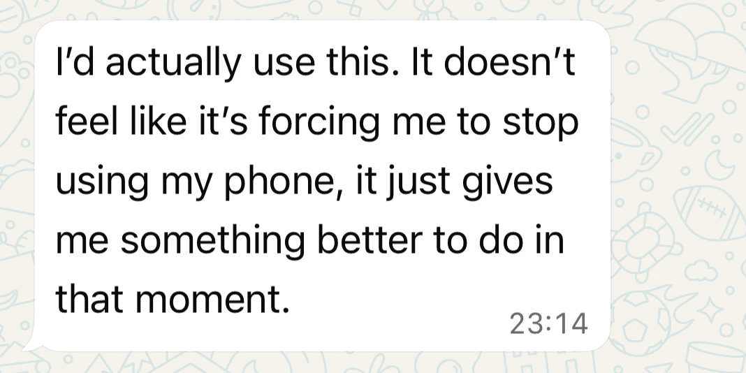
User 1, Female, 22

User 2, Female, 32
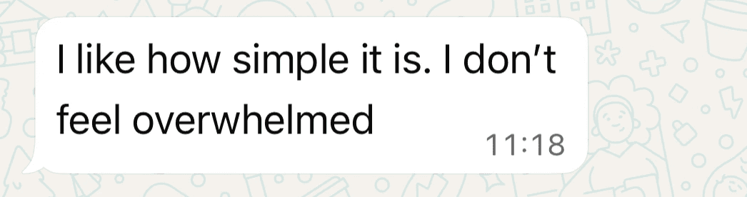
User 3, Male, 27
User 1, Female, 22
User 2, Female, 32
User 3, Male, 27
Learnings
Learnings
Designing Tomo from 0→1 wasn’t linear and it pushed me to grow as a designer.
Some learnings include -
Being the sole designer for Tomo really pushed me to think from all stakeholder perspectives and reduce design bias.
I focused on spending time in defining a clear problem and scope early, which helped speed up the final design process.
The real problem often hides beneath insights—research transformed Tomo from a low-touch idea into a stronger solution.
A strong design system reduces effort by ~70%, so my focus is on building scalable, high-quality design systems moving on.